Showing posts with label typography. Show all posts

Saturday, March 21, 2015

MATS A, Week 3 Picture Books

This week was a real eye-opener.  I've illustrated for books before, but never children's books, and that was the big theme this week.  It was exhilarating.  I had so much fun illustrating the goats and then the trolls, but I was left a bit sad afterward.  I want to keep going... I had so many ideas that I didn't get to illustrate for this one!!

Let's get to the meat here... Here's my image.  I think it's fairly easy to figure out which fairytale this particular scene represents, but just in case... it's from "The Three Billy Goats Gruff".  It's when the littlest goat first meets the troll.


During my research phase (all of 30 minutes), I found out that goat farmers don't like calling male goats "billies" and they prefer the intact male goats be called "bucks" or "rams."  There you have it!  And, this story is really, really violent!  I cannot imagine illustrating the traditional story for super young kids.  I left that to my peers and they did some lovely innocent twists on the story.  I took the assignment as-is, and my direction aimed toward a bit older audience (kids maybe 8+ years old).

I thought it would be really cool to do a comic/graphic novel-type hybrid with the picture book and proposed inserting two panels to illustrate the fear and panic of the littlest goat, but my peers thought it took away from my illustration. The leftmost inserts would have been black and white and shown the hooves of the little guy as he first steps onto the bridge. Dramatic!!  I'd love to hear what you think!


I found that my scenic art background came in really handy in this assignment.  It's what I enjoyed the most.  I loved painting the background and creating the forest and the waves.  AAND, I especially loved doing the troll.  So much fun!  His back absesses and hair and six fingers, yellow teeth, etc. etc.  Had I more time to develop my characters I wanted to add a bat and mushrooms, dead animals, etc. to his fur.  So many ideas!

And, for my fellow artist and illustrator friends who are curious about my process...

Here's are a few WIP screenshots...


And the character development phase...

These are the two fave pages of goats.  There were maybe 10 or 12 sheets full of goats. :D

"Friends" or maybe "Three's Company" meets "3 Billy Goats Gruff":

Baby Goats!!

This week's course materials were really great. The interview with Mike Lowery reminded me that illustrators are people.  Yes, I know, I'm an illustrator and also qualify as a person.  But, sometimes we make such a pedestal out of our dreams that we forget the daily steps it took for regular people to get there!  There was also an interview with a Hatchett Book art director which was really great for learning the process by which picture books become a reality.  It sounds lengthy, but I know a thing or two about that (see my knitting designs)!

Aaaand, this week's favorite for me was actually a bonus by Lilla.  She included this really great worksheet about dealing with self-critique and envy.  I'm constantly at odds with myself.  "Is my style good enough? Marketable enough?  Is it even a style?" All these doubts!  It's great to hear I'm not alone.  Although, it would also be great to have actual answers to these questions. HAH!  Whatever the case may be, I look forward to "Wall Art" which is next week's assignment.

Wednesday, April 10, 2013

StitchinCrochet PRO!


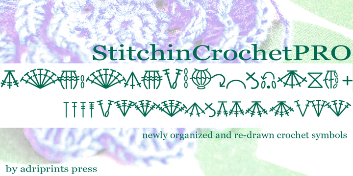
Finally, another loose end tied up. This particular loose end has been around for 3 or 4 years.  I've been collecting e-mails, handy symbols that I missed, and re-organizing this font for a looooong time.  It's done now.  I've simplified the organization of the glyphs so they are grouped together by type: dc increases together, dc decreases together.  I tried to be sure there were corresponding increase and decrease symbols where it was relevant, and I eliminated some of the more fanciful and esoteric symbols that are not used commonly.

And, the result is StitchinCrochetPro now available on myfonts.com!


For more details on what glyphs/symbols are included in this version, check out the "gallery" section of the font here.  It includes the keyboard key and symbol abbreviations guide as a pdf.
Let me know what you think if you get a chance to try it!

Monday, December 31, 2012

Happy New Year!

Hope everyone is having a very happy new year!

2012 was a really productive year here at Adriprints Press!


In sewing and quilting, I made quite a few items, and met my goals for 2012
2 quilt tops (brown quilt is nearly fully quilted)
3 trousers (2 jeans, 1 clover)
1 fitted jacket
1 wool coat
2 dresses
5 tops (1 hoodie, 1 sleeveless, 1 pullover, 1 buttoned sleeveless, 1 buttoned short sleeved)
1 apron
1 dirndl bodice
1 plaid skirt

In knitting design, I had a good number of items published (self-published or otherwise)
Oslo Star Hat
Alhambra Hat
Stripey Legwarmers
Orange Blossom Camisole
Squishy Mittens
Squishy Chullo Hat
Amaranth Shawl
Amaranth Headband
... and I am waiting for a few more to be published hopefully early this year including: a children's line,
Squishy Vest, and a mystery plaid set.

In hobby knitting, I made quite a few items including a really lovely cabled sweater (Beatnik), an Easter bunny/egg, finally knit Sam's second sock, a few hats, and am working on 2 cardigans.

In crochet, I finished one of the cutest projects ever: the Yellow Submarine Booties, designed by my friend Nuria over at Red Sewing Box.


I published 1 font this year, Kicks, and hope to update and create some new ones this year.


And, my 2013 New Years Resolutions...
knitting- publish a few more patterns, learn brioche knitting
crochet - do a bit more of it
sewing- sew a pair of perfectly fitting jeans/trousers, drape 1 dress or outfit
quilting- finish quilting the 2 quilts from last year and make 1 quilt
design - learn more about WordPress to create an online shop

Sunday, July 22, 2012

New Font: Kicks

Getting warmed up in the font arena...
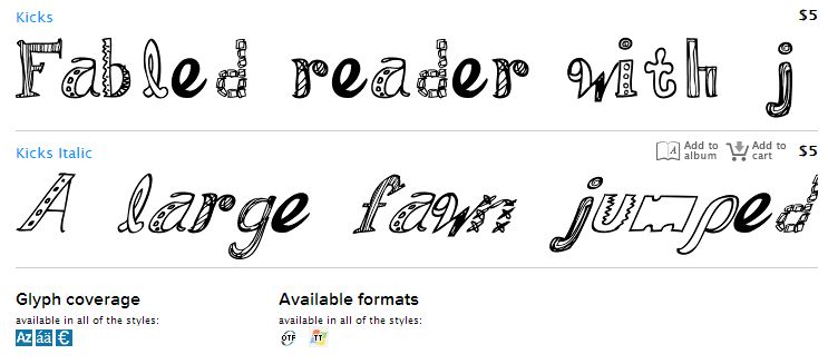
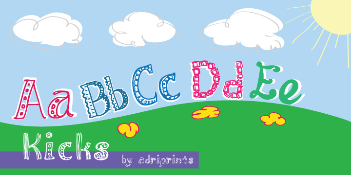
I just finished a new font called "Kicks" and it was made... just for kicks.


Meant for scrapbook text, classroom decor, and lots of other fun stuff, Kicks is a hand-drawn font that finally helped me get over my "font-block".  It's available in regular and italic, single download, or family download.  I'm so glad I finally got this one out.  Look out for more in the near future...

Yay!


Friday, October 21, 2011

Pro Work: 3M Unitek Teens

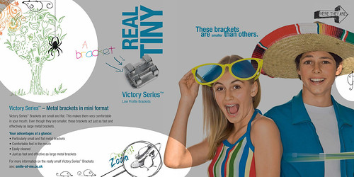
It's been a year since I did these illustrations for use within the 3M Unitek: Teens site for braces website...

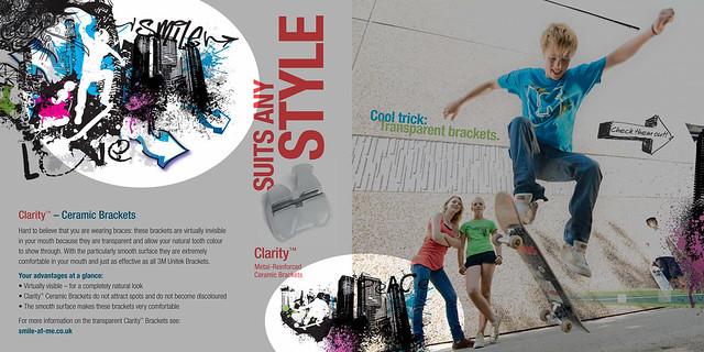
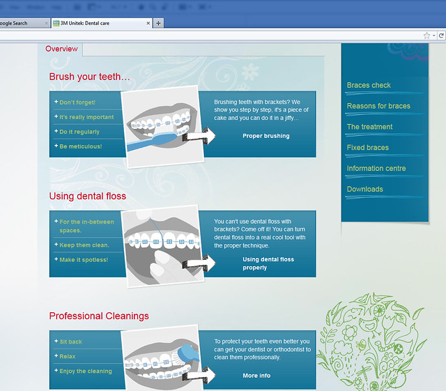
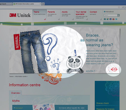
Now since it's finally online & published, I can share them with you all!  I've highlighted the illustrations, and described what I drew in the captions since most of the final images are a blend of my work, and my colleagues' work: layout, stock illustrations, studio photos, and text.  Credit has to be given to the art director, Tina Heller, whose vision was really clear and fun.  She was an awesome director to work with!


nature tree, mouse
tree, mice, magnifying glass, mouse with hat
vector skateboard collage, graffiti arrow, "smile" text

About the project: these illustrations were for use on a site for the orthodontics branch of 3M, and the target audience was teens & kids.  There were concepts emphasizing the size of the brackets, style, and types of brackets.  Other illustrations were for the FAQ section and Help sections including the diagrams on how to care for your teeth with braces.  It helped that I had to wear braces for nearly five years.


3 vector illustrations on braces  hygiene, nature tree

Oh yeah!  And panda guy...
panda with braces, question marks, lips

If you'd like to see more, they're on my flickr page here.

Tuesday, July 19, 2011

July 19th, Typodarium Font of the Day!

For those of you typophilic enough to have the Typodarium calendar, my font "Fiddleshticks" was today's date!

Monday, June 6, 2011

My font was May 8th!

Typodarium put out a 2011 Calendar, and I forgot to mention when it was May 8th that my font Trellis was featured as the font of the day!


Yay!

Sunday, June 27, 2010

Blog Headers: Street Hanger Updated


Street Hanger's Vanessa Borge and I worked up some updates to bring a fresher look to the blog header, along with some major changes to the background, fonts and color.  We brought back some of her original ideas of having a really colorful background, and I drew up some accompanying illustrations to bring a bit of flourish and to add some weight and presence to the header.

It's a cool site content-wise... Street Hanger is a consortium of all sorts of fashion forward "this and that-s" and I'm glad I got to work on it.  You can check it out here.


Thursday, June 3, 2010

Blog Headers: Street Hanger

I just had the pleasure of working with Vanessa over at Street Hanger, a lifestyle blog.  She asked me to re-do the blog header and styling, and it was lots of fun.  Here's what I came up with for the header...


She wanted a simple, stylish header to match her aesthetic, and I think whilst working together, we came up with something pretty pretty.  Go team!

Next, I think I'm going to work up a background image to match... still visually a work in progress, but you can check out her blog here.

Friday, April 23, 2010

Finally... Stitchin Knit

And after over a year of development and testing, no further ado...

You can find it via Fonts.com here or via MyFonts.com here if you're interested!
And the PDF files are now available through the gallery view...


Monday, April 19, 2010

How to Use StitchinCrochet with... Adobe Illustrator (Final Steps)

Here are the final steps in the StitchinCrochet video tutorial series which began a few weeks ago with an example star pattern.

Step 4:


Step 5:


Thank you so much for following this series!

Thursday, April 15, 2010

New Font: Fancy Pants

I can't believe I forgot to tell you all, but I released a new font last month, and apparently in the rush of having my parents visit I forgot to post.


Fancy Pants is my first attempt at a semi-linking cursive script.  It was developed from some sketches I did last year (I KNOW!!) and finally got around to converting and tweaking.  It's available from MyFonts.com and has a bold and italic version available too.  I also had a bit of fun writing this really mean "dear john" letter to no one in particular.


Sunday, April 4, 2010

How to Use StitchinCrochet with... Adobe Illustrator (Step 3)

I started posting tutorials on how to use the font I created, StitchinCrochet, with Adobe Illustrator.  In today's post, I will finish off the tutorial on how to use those symbols from the font to arrange the final center row, and then the points of the star.

Step 3: doubling the single crochet stitches


Step 4: adding symbols for the star points, and finishing
See post here for the next steps.


Thursday, April 1, 2010

How To Use Stitchin Crochet with... Adobe Illustrator

This is the first tutorial using StitchinCrochet, the crochet symbol font I designed last year.  I realized after many requests that a "how to" would be nice to share with you all.  So, without further ado...

Our example pattern:


Preparatory steps and prerequisites for this tutorial: download/install/purchase font (you can do it here), have adobe illustrator, basic knowledge and skills within Illustrator.  Next, open a new file, type the necessary symbols using stitchincrochet as your font (I used: 0O&1@23K>), then Menu>View>Show Grid...

Video Tutorial here:
Step 1: Setting up your workspace and starting with a center chain stitches and slip stitch


Step 2: Arraying the second row (2 single crochet stitches into each chain stitch)

Stay tuned for the final steps in preparing your crochet star pattern!

Step 3 can be found here.

Final steps can be found here.


Thursday, November 19, 2009

Trellis Poster

Here's Trellis and Trellis_Alt! You can check them out in depth here.


Friday, November 13, 2009

Friday, July 10, 2009

StitchinKnit Preview

Look what's finally on it's way! Anyone want to beta test it? Message me!
Update: Thank you my intrepid volunteers!!!

Thursday, May 7, 2009

Announcing Sorbet!

Sorbet is available starting at $0 with the limited style, and prices go up from there for the other styles. Yay! Sorbet font can be found, downloaded, or purchased here!

Tuesday, March 10, 2009

DraftPunk & Fiddleshticks

Yesterday, I was notified that my fonts would be available for the public by today, and sure enough... They're here!

So, if you'd like to download my fonts, they are now available from MyFonts.com at:
http://new.myfonts.com/foundry/Adriprints/

There are free versions available along with a priced complete font set version.