Showing posts with label surface patterns. Show all posts

Tuesday, January 5, 2016

Hello 2016!

Whoah!  Where did 2015 go?  It just flew by I tell you!
I can't believe it was already a year ago I was sitting at my studio in Munich getting ready to get my illustration career back on track, and here I am now in California ready to launch the sales portion of my career!


In 2016, I hope to make some sales of my artwork as greeting cards and prints, as licenses on products and fabric!  Lots of work to do!  I'll keep you posted... and don't forget, you can always see my most recent work on instagram here.


Wednesday, November 11, 2015

Scrapbooking: Greetings from the Lido Deck!

I am so happy with this one!  I couldn't believe I got it done on time to be considered for the Make Art That Sells weekly review either.  Our things finally arrived from Germany and it meant we were in super-unpack-cardboard-box-processing mode!  But, I was also in a "making mode" as well as "where the heck is my scanner mode"... and so I made and found my scanner at last.

Here is my work resulting from the theme we were given: vintage cruise ship correspondence.  It's a bit of a mash-up but I think between the chosen color palette and my brush pen illustrations which have a late 50's early 60's vibe in them, that it's enough to cover the vintage aspect.   I really wanted a PiƱa colada after drawing this... love those so much.


Wednesday, November 4, 2015

A Group of Charming Cuties

Last week, I had something very interesting happen.  I had a kind of cute-splosion.  I started illustrating for the children's apparel market so I can begin to pitch my work.  I did some short research by looking at my son's clothes and picking out my super-top favorites.... and then it all just flowed.

It was remarkable.  I just worked on Illustrator and out came these characters and their back-stories and little lives.  I kept wanting (and still do) to keep on drawing them and their accessories and interactions...


Next, I want to develop each character on their own!  What do you think?

Wednesday, July 22, 2015

Summer School Illustrations

We're in the thick of summer here in Munich and it's been non-stop illustration, sewing, and knitting... okay, not so much the knitting because my current knit-along includes very warm yarn, lots of cables, and a steek, so I tend to wait for the weekend for that.

But I've been painting and illustrating and printing and working on building up my portfolio in preparation for Surtex 2016.  I enrolled in the Make It in Design course The Ultimate Portfolio Builder, and also their Summer School course.  These are much more self-directed than the Make Art That Sells courses, but I'm determined!  And, I've really appreciated the personalized feedback that the UPB course offered.  I got to hear directly from Khristian A. Howell herself about her thoughts on my work and website.  That was probably the most valuable 15 minutes of my career.  I found her feedback so helpful and it really makes me want to push my work to the next level!

Here is some of my most recent work...

(Mind you, these are mock-ups and none of my work is actually in production yet... YET!)


Monday, May 18, 2015

Make Mine a Mini

My first animated illustration in at least 7 years.


I made the video itself over a few days, but the artwork had already been through a storyboard, script, etc.  Honestly, I had too many ideas and now resort to watching my own video to avoid repeating my own mistakes!  The purpose of the video was to present our favorite lesson learned in the Make Art That Sells course.

Last time I did any sort of real animation was 7+ years ago through elective classes at RISD which I adored.  You can see it here if you're curious (the lady was my puppet).  And, while I'm parading my freak-flag, I might as well share my old animated .gifs which you can see here.  Those were done using Photoshop layers.  I blame my brother for that.  He got me into pixel art (you can see his work here & here -- he mainly works in 3D).  This time, though, after going through all the prep work: writing a script, drawing a storyboard, starting my illustrations, scanning them in, ready to start animating... I froze!  I psyched myself out!

I knew I needed to use something else to help me get the results I wanted because I wasn't going to do traditional animation.  I thought of using either Flash or After Effects, but it seemed like such a huge task.  I chose After Effects and started exploring it through various tutorials trying to chip away at it and taking the skills I needed to get the effect I wanted.

- - - -
Helpful Tutorials:

First, I started with the Adobe.TV tutorials here which are fine (a little dry, but efficient).

Then, I watched this tutorial series from Phil Ebiner on Skillshare called "Complete After Effects Course" to familiarize myself with the skeleton of the software.  These tuts run somewhat long and you can skip the first 15-30 seconds of each.  These could be condensed.  I recommend with reservations - pick and choose what skill you need to know more about.

Next, I watched Jake Bartlett's "Animating With Ease" Skillshare series and this is where the meat is.  He masterfully edits all the episodes into 100% content.  Have a notepad ready.  Have After Effects open in the background or separate screen.  Be ready to go.

For very specific tasks like the walk cycle or lip-syncing, I really like Fraser Davidson's tutorials also on Skillshare.  The "con" to the walk-cycle course is that he uses strokes to make the limbs.  This makes most people's projects from the class look very similar.  I do like his tutorial-style and he does illustrate the concepts clearly so they're still valuable.  Also, he's humorous and his tutorials are fun to watch which is often not the case with tutorials.

Also, I dedicated an entire post to sharing my workflow in detail in case you were interested!

Thursday, May 14, 2015

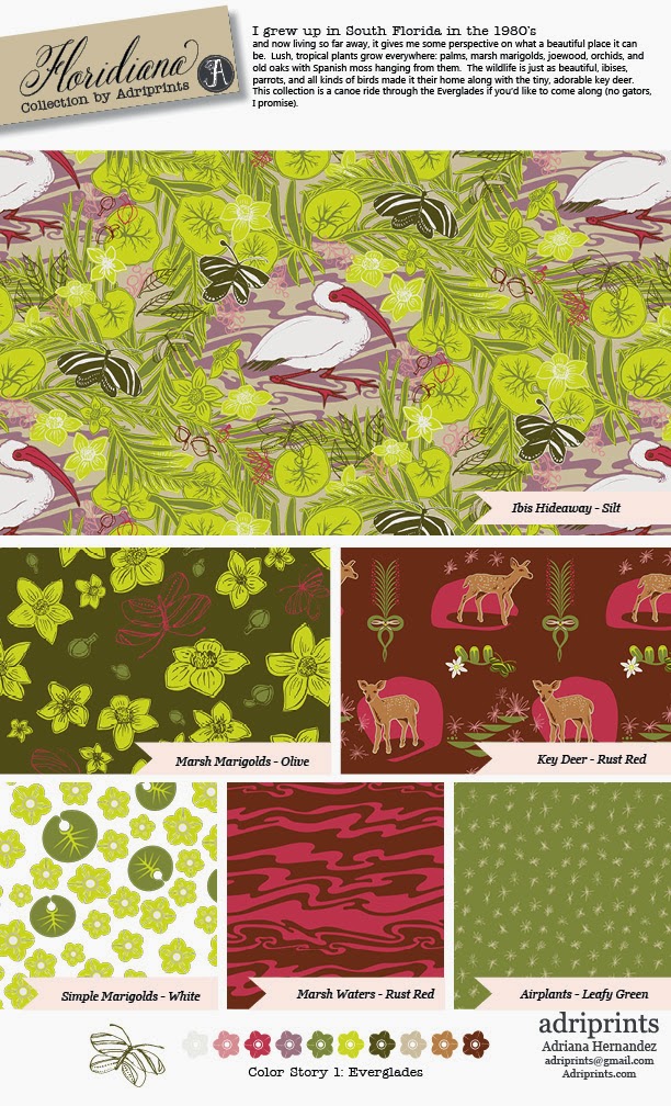
Floridiana: Behind the Scenes Part 2


I first signed up for Bonnie Christine's Surface Pattern Design 2.0: Start a Career Skillshare Class in April, but I kept a diary of my process, and thought it would be nice to share with you all, my readers.  This is Part 2 of 2 explaining my process behind the Floridiana surface patterns.

May 4, 2015

My first go-around at putting the patterns together with Palette #1(warmer colors)... I think I need some with more patterns with open space.  I see now that I tend to make very "busy" patterns.


 May 6, 2015
I tried my hand at doing  a room mock-up, and yes, confirmed that I need some patterns with less "stuff."  Okay!  Will do!


May 6, 2015: Finals Uploaded
May 7, 2015 - Edited Images for naming consistency
With so many patterns in the collection, I found that I had to go back and re-check to see if they were all exactly the same in all the final documents.  Maybe next time I will choose simpler names!

Color Palette 1: the Everglades (warm colors)


Color Palette 2:  Night & Day (Cooler Colors)


Mock-Ups
Some are better than others, that's for sure!  Here are my attempts at trying to pull a room together and  mocking up products using the patterns in the Floridiana collection. This is an area where I absolutely have room for improvement!


Phone Cover
Are custom i-phone covers really a thing?  I'm a bit behind in this trend.


Stationary
This mock-up excited me the most! I love paper and stationary!


Clothing
I think the KeyDeer print would make a lovely t-shirt... and dress, and skirt, and lots of other stuff too, but this post is waaaay long as it is.


Thanks for stopping by and making it through the entire project!

-Adriana


Tuesday, May 12, 2015

Floridiana: Behind the Scenes Part 1

I first signed up for Bonnie Christine's Surface Pattern Design 2.0: Start a Career Skillshare Class in April, but I kept a diary of my process, and thought it would be nice to share with you all, my readers.  This is Part 1 of 2 explaining my process behind the Floridiana surface patterns.

April 10, 2015
My hometown is a place full of contradictions.  I grew up in South Florida mostly in Miami, and being far away from it gives me some perspective on what a beautiful place it can be.  Lush, tropical plants grow everywhere: palms, hibiscuses, bougainvilleas, banyan trees, vines, orchids, and old oaks with Spanish moss hanging from them.  Wild parrots, ibises, and all kinds of birds made it their home along with the tiny, adorable key deer. It's not completely unheard of to find a gator in your yard, and/or see celebrities with their tiny dogs in their handbags.  Summer in Miami usually meant a long stay at the beach with your family... sardines on crackers, collecting seashells, water out of the cooler, running to the shade to avoid burning your feet, and do NOT feed the seagulls...
I'll see what kind of journey this reminiscing takes me...

April 15, 2015
First, a snapshot of our family.


All of these photos are from my family's albums.  Unfortunately, my grandma is not in any of these since she was usually behind the camera.   See what I mean about the palm trees?  Our backyard faced a canal that frequently had gators floating by.  We always had family over the house, and there was never a dull moment growing up.
If anyone else is working with family photos, isn't it hard to stop looking through all the photos?  I had to stop myself before I got too emotional.  I just wanna reminisce!  I miss my grandparents very much (they've all passed).   But, after mulling it over, I think I know what I'm going to draw now.

But first, an exploration in color.  My 2 (preliminary) palettes with colors directly from my family photos...
I've divided my colors between past and present which, in turn, created a warm and cool palette.  Handy!


Next, it's sketch time!

April 25, 2015
So I've been researching local Florida wildlife, flora, and fauna and started to sketch!  


I think I'm going to need to make a moodboard to help guide the style before I go digital.


April 29, 2015
I most definitely needed a style guide!  So I made one using my favorite print heroes.


April 30, 2015
And then I digitized and refined a lot of icons including lettering...


May 1, 2015
Working on the "hero" or main pattern, I chose to work with the ibis (instead of the key deer).  I may still do a repeat with the deer, though, since it's so cute.  But, here's what I did so far with the main one.  It really helped to have my style guides to help me figure out how I should lay out the ibis.


Monday, April 13, 2015

Working on Magic

Something clicked for me after MATS A, and that's the concept of joy in one's work.  I connected it finally with the idea of creating magic in an illustration. It's something I have struggled with for a long time, and am always working on.  So, this past week, I made it a point to focus on this element and re-work some past illustrations.

I started with my sketches from the Global Talent Search back in 2013.  I loved my sketches for this project, but ended up submitting something completely different and kicked myself afterward.

Anyway, I worked with this palette which I used for the competition and that I love, and it helped me focus on just having fun and making a sweet little repeat.

revamped repeat

original illustration from 2013

Next, I thought of a different concept with the playground scenario.  What if the playground animals came alive at night and had fun jumpin' around in a magical firefly forest after dark?  So, I re-inked the original sketches, illustrated all-new spring animals, and created a night-time palette to help me focus on illustrating.  Here is what I came up with:

alternate night time theme, 2015


Wouldn't it be so cool if it came in actual glow-in-the-dark fabric?  I keep thinking of a pajama set for my little guy that glows in the dark!  That would be neat!

Monday, March 30, 2015

Surface Design, Botanical #1


After taking some general online courses on Surface Design, I came upon this one by Bonnie Christine on Skillshare.  I started this project in late February, and kept a lot of detailed notes on my progress.  Can I tell you how much I've learned in the videos from Bonnie Christine's class?  It's crazy!  I have been using Adobe Illustrator for over 10 years, and I thought I knew my way around, but I learned so many new tricks in this class that I hadn't ever even thought to try!

I was humbled by the class and how much I have left to learn about design and my favorite software.

Also, as you know, I've spent all of March working on MATS projects.  So, in between my projects and the fast-pace of each week, I've been tweaking and applying my new skills to this pattern repeat.

Here's what I did for the class:


And here's the diary of my entire process...
February 23, 2015
Choose a word, short phrase... Bloom?  Blossom?  Botanical?  Not sure yet, but I think I'll go with one of those.
Favorite things in nature... red squirrels, muscari azureum (grape hyacinths, and also bluebonnets and bluebells), new leaves, buds of flowers, dogwood blossoms, peonies and round blossoms, cacti, lithops & succulents, daffodils and narcissus, orchids, etc.  Bright saturated colors.

1 colorful photograph (for palette) & 3-5 photographs (thematically related, to draw from) -- See mood board labeled "Botanical #1".  I love this bouquet I found on Pinterest.  And, I found other beautiful photographs on several photography sites.  I'm personally not that great of a photographer and so I looked on Pinterest, Flickr, and used keywords of my favorite things to find inspirational photographs.  

Mood-board Photo Origins: I searched for the origins of the peonies bouquet, but to no avail.  The leaves, curled seed pod are from photographer Alan MacKenzie a very talented wildlife photographer.  The daffodils and muscari azureum on the top right of the moodboard are from Better Homes and Gardens magazine.  And the red squirrel is from Birds in Berlin blog.


February 24, 2015: Choose 10 - 15 simple/med complex sketches  I'm thinking the squirrel, hyacinths, and the succulents will be my complex elements and perhaps I'll simplify everything else into 1 or 2 colors.  Maybe I'll use just the filled-in outline for some, and/or the line-art.  Time to play!

February 25, 2015: Digitizing the sketches
This was somewhat tedious, but in a zen-like way.  It's digital tracing using a bunch of different techniques.  Some I used my own custom brushes in Illustrator, then expanded the stroke.  Others I used the blob brush as instructed in the videos.  Then Others I used a black marker and filled in areas using my tracing table, and then scanned, and did "live trace".
March 1, 2015: Simple Repeat
Alright.  I have to say it.  This class is ROCKING my world!  I just tested my simple pattern repeat, and using my palette, I "recolored" the artwork.  To my amazement and wonder, I now have 3 colorways that I absolutely love.
What do you think?

March 4: Complex Repeat WIP  
Here's where I am with the motif for the complex repeat.  I've struggled a bit to get it where I want because one of my goals was to add texture to my work.  So, I made some textures, scanned them, etc. and got them to be vector-friendly.  Then, I learned that you can't make a pattern repeat from something with a pattern in it... so be sure to expand all your elements before trying to make a pattern from it!  I learned that after a while of trying to drag it into the swatches panel with no success.  Oops!  Lesson learned!
March 18, 2015: Complex Repeat WIP The past few weeks I've learned a few things about repeats.  I bought and read several of the books that Bonnie recommended (mastering the art of fabric printing and design & the field guide to...).  I also learned some new work-flow for Photoshop and back to Illustrator in order to add texture and correct alleys and holes  and too easily recognizable repeated motifs.

Also, I went back and re-inked some of the original motifs that felt a bit lacking, and here are the newly inked icons.

March 30, 2015 And, if you look at the version I submitted, you'll see the versions above were the ones I used.  

The next steps for this project:  
  • add more geometric/abstract patterns
  • refine the color palette
  • find a fabric manufacturer who would like to work with me to print the collection!


Sunday, March 8, 2015

Picante Dirndl

When I was a kid, I loved comics.  I was a big fan of the "what-if" and alternate reality issues that comics would sometimes print.  This idea of "what if's" popped into my head as I posted about this past week's MATS Bolt Fabric Assignment, and it wouldn't let go.

What if... I did make a dirndl out of my own fabric?

I imagine it looking like this!  I used Burda's Dirndl Pattern 8448 as the basis for this visual mock-up.


I think that would be really unique to wear to Oktoberfest 2015!

Please note that I do not have any affiliation with Burda or their patterns, and I do not represent Burda or their parent company in any way.  Just an illustrator and DIY-er here.

Saturday, March 7, 2015

MATS A, Week 1: Bolt Fabric

The first week of MATS (Make Art That Sells) Part A went really, really well.  I was so anxious and scared to begin with, but I felt right at home illustrating the mini, and then later the actual assignment.  My fellow classmates were super supportive, and their work is really great!  It's awesome to see what others are doing and it helps me to figure out what to tweak next.  I see how they handle certain elements within a design and it sparks a solution in me.  Lots of zeitgeist, enthusiasm, feedback, and visual inspiration!

I also like that the turnaround times are short in order to force me not to spin my wheels.  I have the tendency to overthink things if given too much time.  The deadlines of the course plus the unpredictability of the baby's toddler's schedule make for a nice sense of urgency that makes me productive!  This past Thursday night I turned in my final, and here's what it looks like...


This was the layout that I turned in, and I'd like to change certain elements moving forward, but I'm happy with the overall direction I chose.  Our mini theme was "pretty peppers and pyrex" and then the big assignment was "vintage kitchen" as the target niche.  I kind of tweaked the theme to "I love Tex Mex please join me in celebrating my love for enchiladas through the lens of 1972."

As many of you who know me already know, I lived in Texas for a few years and my husband is Texan.  His family live in the southwest and we visit nearly every year.  Here in Germany, Tex-Mex can be found, but it's not the same.  When I visit TX and NM, the food is something I enjoy very, very much (I nearly went with vintage + BBQ!).

Interestingly enough, living in Germany for so long seems to have rubbed off on me.  One of the coordinates ended up looking like one of my favorite traditional dirndl fabrics (the green/white one on the lower right).  I think it would be really cool to have a dirndl with chiles on the bodice or apron!!

Process
Mini: peppers n' pyrex
Original Mood-board


Roughs
first linocut in over 10 years!


To give you a breakdown of what I was working with, I scanned in my images and isolated roughly 80 to 90 individual icons. Once the additional category of "vintage kitchen" was given, I shopped among them for the most appropriate ones.  I had already digitized them, but not yet colored them.  Next, I added textures, finessed the little details... but there's always more to do.  If anything, I've already learned that.  The details make or break the illustration.

Thoughts on Week 1 Course Materials
I found the break-down of the assignment to be very helpful.  I love the act of chunking the work into tasty morsels, and so the structure of the class suits me well.  Most days we had a post to read, an interview to watch, skills to learn and/or industry tips and tricks to absorb.

The information given in the class materials is really specific and valuable.  This past week there were even additional workshop materials from the Art & Business of Surface Pattern Design course that I considered taking.  I think I'm in the right place because I already have a pretty good understanding of the technical aspects of making a repeat through my background experience with Illustrator and the Creative Live, Skillshare classes from Bonnie Christine and Elizabeth Olwen, and the books I read on pattern design.

But, the interview with an industry professional was invaluable.  So was the style analysis worksheet and Lilla's advice.  In short, I'm so glad to be taking this course.  It's exactly what I needed!