Showing posts with label MATS. Show all posts

Tuesday, August 16, 2016

Bright & Cheery Tea Set


Project Brief: Design a cheery tea set for a Sunny client. 1x tea cup, 1x saucer, 1x napkin

The brief called for the design of a teacup, saucer, and napkin... but who could resist not designing the entire set?! Not I! I love tea!

What should it have on each piece? I'm not a big fan of the lacy, teensy, frilly flower on my tea sets as many traditional ones do.  And lately, I've been really enjoying working with traditional printmaking methods especially linocut. I made a bunch of patterns and arrangements using stamps I made on my own, and some I took into the digital realm and began testing repeats that way. I was really excited to use my recent patterns on something I'd love to own and see every day. I'm a big fan of tea and the paraphernalia that comes with drinking it.

So I set about sketching and came up with a concept that I'd love to have in my own home. The sketch gave me a general idea of how I'd present my work, and then I set about testing colors.
My first tests with pink...

Oh, I was so unhappy with this color combo! It's not me at all! I'd never buy it. After asking my fellow finches why I hated this so much, they reminded me I don't usually use pink in this way... and they're right, this is not really my shade of pink, nor do I own any pink tableware or pair it with sunshine yellow. Out went the pink!


Once the bright aqua and seafoam green went in, I was gelling. The work just came together so quickly. I knew I had to have sugar tongs and a sugar container, a little creamer, too! Finishing touches...


And lastly, I went to work balancing the tea-set. I wanted to have a nice mix and match tea set and napkins that could work in many different combinations. So the second saucer carried the more intense color, and the mugs match. The tea tray got a nice under-pattern and texture to match.

There you have it! Tea for two... a cuppa for me and one for you!

Tuesday, January 5, 2016

Hello 2016!

Whoah!  Where did 2015 go?  It just flew by I tell you!
I can't believe it was already a year ago I was sitting at my studio in Munich getting ready to get my illustration career back on track, and here I am now in California ready to launch the sales portion of my career!


In 2016, I hope to make some sales of my artwork as greeting cards and prints, as licenses on products and fabric!  Lots of work to do!  I'll keep you posted... and don't forget, you can always see my most recent work on instagram here.


Sunday, November 29, 2015

Chicken Picnic


This is my final piece from the Make Art That Sells Course (Part B).  It was a revelation for me to just do what I do in response to a brief, and use my icons that were created on a whim earlier this year and then put it all together.  It's a revelation to just be in a flow and making work.

I asked my teammates from Finch & Foxglove for feedback and adjusted accordingly.  It's been really nice to be able to get into a groove and feel like you had a place to turn for a dialogue about your work.

As for process, at the end of the summer I painted these chickens in watercolor and gouache.  This past week I drew most of the rest in marker, brush-pen, watercolor pencil, and gouache.  The textures I've been collecting all year, and I made some more.  I shared some of my textures recently on a live Periscope broadcast too!


I thoroughly enjoyed MATS B as it seems the topics suited me better.  In addition, though, it looks like I've grown some confidence between MATS A in March and MATS B in October.  Cheers to vast improvements and self-confidence!

Also, I'd like to invite you all to follow along with our Finch & Foxglove Advent Calendar starting December 1st.  Watch the advent calendar page here!

Monday, November 16, 2015

Santa Barbara Map

I'm still very new to this town, but here's my visual impression of the place so far...

Lots of people doing stuff out in the open all the time.  Bright sunny days, beautiful vistas, lots to do with your family or on your own. Oh, and lots of great cycling.  Have you been to Santa Barbara? What were your impressions?

Wednesday, November 11, 2015

Scrapbooking: Greetings from the Lido Deck!

I am so happy with this one!  I couldn't believe I got it done on time to be considered for the Make Art That Sells weekly review either.  Our things finally arrived from Germany and it meant we were in super-unpack-cardboard-box-processing mode!  But, I was also in a "making mode" as well as "where the heck is my scanner mode"... and so I made and found my scanner at last.

Here is my work resulting from the theme we were given: vintage cruise ship correspondence.  It's a bit of a mash-up but I think between the chosen color palette and my brush pen illustrations which have a late 50's early 60's vibe in them, that it's enough to cover the vintage aspect.   I really wanted a PiƱa colada after drawing this... love those so much.


Sunday, October 25, 2015

Sweet Tidings to You!


It's only October, but the holiday card making season has just begun.  This week was the first week of MATS B (Make Art That Sells, Part B).  It was a good thing that the course started when it did as I got things somewhat in order and got back into the "making" groove here in our new home.  I set up a workspace on the kitchen table that came in the mail a few days before class began.  We put it together pretty quickly and cardboard boxes became work-space dividers, empty yogurt containers became brush holders, and old palettes from undergrad saved the day!


On a side note, though, does anyone else do that?  Do you leave things for your future self just in case x, y, or z happens?  I left a mini travel kit at my mom's house and unearthed a bunch of my tools last year when I visited during the holidays with the baby's first visit to the U.S.  And lucky for me that I did because I had a great little kit waiting for me this time around when I had nothing but my 2 suitcases for the baby and me after the move from Germany!

The first week of MATS focuses on paper (greeting cards in this case).  And our theme was holiday cookies.  I started the mini using my dipping pen and nibs with Windsor & Newton india ink.

Then, I did some icon painting with gouache.  And later I did some in Copic marker.


Next I put it together in Photoshop and Illustrator and worked on icon placement...


It seemed too brown to read as a holiday card, so I added blue and white to get that winter feeling in there.  Then, I added some extra cookie illustrations within the jar, added texture to a bunch of items (jar, sprig, thread, tag, etc.).  Finally, I put it all together in InDesign and added a few stationery accessories like the gift tags and possible stamps that I thought would work well with the remaining icons.  See the first photo for the final result.

Saturday, June 27, 2015

MATS Bootcamp Recap

Another recap!  It's the end of the MATS Assignment Bootcamp unfortunately, and our last assignment was an editorial illustration.  We were given an article about digital nomad-ism and it felt pretty close to home.

I am definitely a digital nomad.  I spend lots of my time traveling back and forth from Germany to the U.S., but also to other parts of the European continent while still maintaining contact with clients and working on personal projects.  I related so much to the advice in the article... it's all about wi-fi and connectivity.

Traveling has been a constant in our lives, but now we're looking at repatriation as a reality.  We'll be moving back to the U.S. in the autumn and I simultaneously eagerly await the next chapter in our lives while mourning the separation from my long-time friends.  It's not our first goodbye to Munich (remember that Amsterdam 6 month dream sequence back in 2011?), and hopefully it won't be goodbye forever.

So where are we headed?  We're going to sunny California!  Don't worry, I'll be writing when I get there, but I'll first be stopping by my mom's place in Florida while we figure out where we'll be living in California.
- - -

Back to the MATS Bootcamp re-cap!

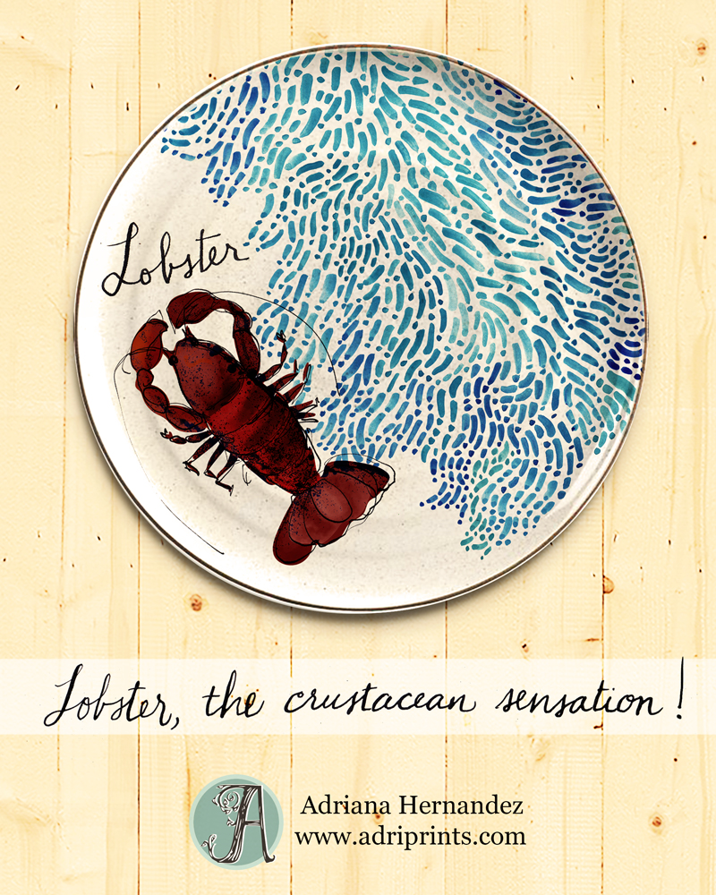
May brought us the crustacean sensation theme as I called it...
I was really pleased with the background pattern and came out with a stoneware plate or tray that I'd buy.


April was the Global Art Gathering poster.  I'm so glad I got to see Brighton in real life... I'd draw the dome differently now that I've seen it in person.  At the moment, it looks a bit like our American capitol buildings. I am still happy I did some painting, though.  The loose style came very naturally to me when used paint and collage.


March we worked on MATS Part A so Bootcamp was on  hiatus.

February we painted on wood.  We were riffing off of Lilla's plate collection and I had been drawn to a central character with foliage.  I'm loving the ladybug character, but I think I could push the whole thing a bit further in one painterly direction with more texture.  Something's missing and I don't know if it's just the mock-up or what.


I took February's assignment further and mocked up some plates too with some of my preliminary designs...


And January we worked on a journal cover. I feel like I've come a long way since our first assignment.  I was so nervous, and I clearly overworked the design now that I can see it with a fresh eye.  I enjoyed every minute of it, though!


Wednesday, April 8, 2015

MATS Part A - Overview and Review

5 weeks of illustrating like crazy!
 The following is a two part review of the Make Art That Sells course Part A as it was presented this year (2015).

1) A Review of the Make Art That Sells Course, Part A (from the heart)

MATS is a meeting place for people all around the world who are looking for their "tribe."  I know that's a word that's flung around a lot these days, but I don't have a better word for it... I guess I could say like-minded or similar seekers.  The community that is created after sharing our work, well, it's kind of intimate.  When you're working so hard on a dream that you hold dear, and you share it with others who have a similar dream, it's not difficult to see why we come together and why the course begins to take on a deeper meaning. MATS has a following because we feel connected to one another.

What about the work?  I can only speak for myself.  I have grown a lot and I think you can see it most in my final two assignments.  I used the five weeks of the course to try and discover a style within my work.  I wrote in my pre-course planner, "I have invested in this course because I want to make marketable art that feels true to me in a style that rocks!" So, I experimented with various mediums and line and hoped a style would jump out at me.  I can see a common thread running through all five pieces, mostly it's a color-based thread, but no obvious style jumped out at me.  The biggest thing I learned is to stop being slap-dash about my work.  I can see in my final piece a deliberateness that wasn't there before.  I am taking the lesson of deliberate mark-making as my biggest achievement in these past 5 weeks.  Did I achieve my original goal?  I think I kind of did.  I think all of my work feels true to me, but I don't think I'm far enough along in my illustration journey to say, "Yes! I love this style!  You, oh thick line and wavy brush, you will be my style from this time henceforward!" or whatever.  Not there yet...


2) A Review of the MATS Course, Part A by the numbers

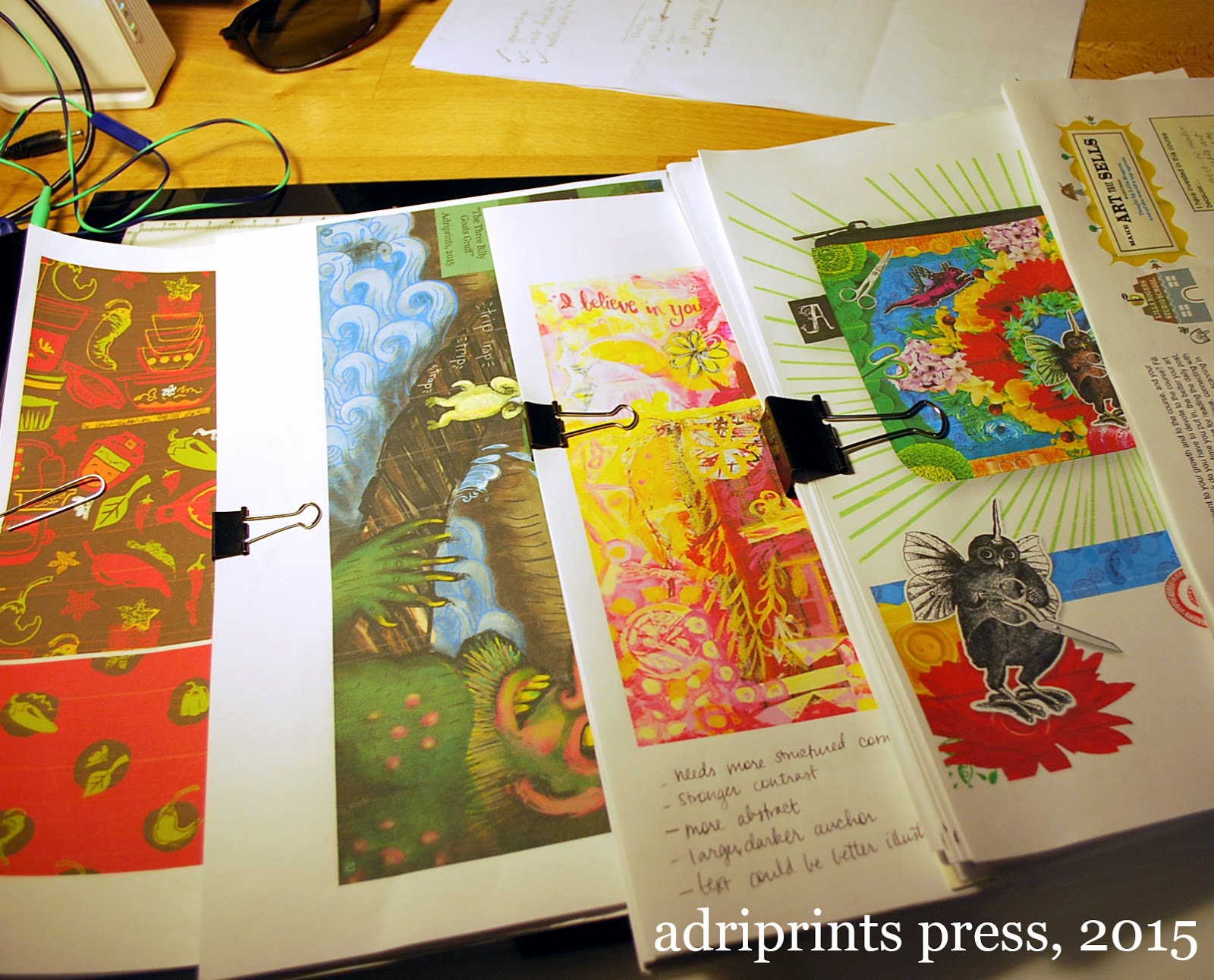
Let me give you an idea of how dense this course is.  I created an outline in order to keep track of all the materials after the final wrap-up post, and it took me 12 hours to do a cursory review and download the course materials.  TWELVE HOURS!!  If I were to collate all the pages and content of this course, it would amount to a very, very thick 3 ring binder.  It would be somewhere between 200 and 300 pages of material.  The first photo in this post is just a fraction of the content.  I printed out only what I intended to fill out or jot notes on.  And this is just Part A! There are several hours of videos including interviews with successful working illustrators and artists.  There are written interviews with experts in the business.  The course includes so many helpful tips, tricks, lists of possible clients, and a very large, supportive community (see part 1 of this review).

It is an intense course requiring the quick turnaround of 5 briefs from concept to layout/mock-up in five weeks.  Each project is broken up into a mini assignment at the start of each week, and then the fleshed out brief is given mid-week with the deadline of Sunday.  I loved the deadlines, and I happily met each one.  I loved being given the assignments, too.  It was nice having direction given to me. :)

And finally, many people who are reading this review are wondering about the reviews.  I will be straight with you.  My work never made it to the reviews.  Each week, Lilla Rogers chose 9 to 13 pieces to talk about.  There were over 150 people signed up for the course.  Many of these people, I'll say 20% are professionals.  Remember people take the course for all kinds of reasons including re-booting a career or refreshing a portfolio.  Some of my peers taking the course had already done editorial work with big name magazines and others had illustrated entire children's books, others were total beginners.  I was... in the middle.  So, I wasn't surprised that my work was not chosen for review.

On one level, of course I was disappointed!  I want to feel validated just as much as the next artist.  But, after every single review without fail, I looked at the checklist Lilla used to discuss the merits and drawbacks of each piece and I saw that even though my work had some of the elements listed, there were always a few missing.  The work reviewed often had a little something extra or something special about them that my work just didn't have (or doesn't have YET!).

It's also a matter of taste!  I know my work runs a bit dark (see troll and mash-up creatures), and Lilla represents some really joyful and happy art.  I'd like to make art that makes people feel joy, and I need to get back to that place.  I was there once.  Here's a throwback photo for you all.  This photo is from the RISD Graduate Student Publication "Making Something with Some Things" from 2008...
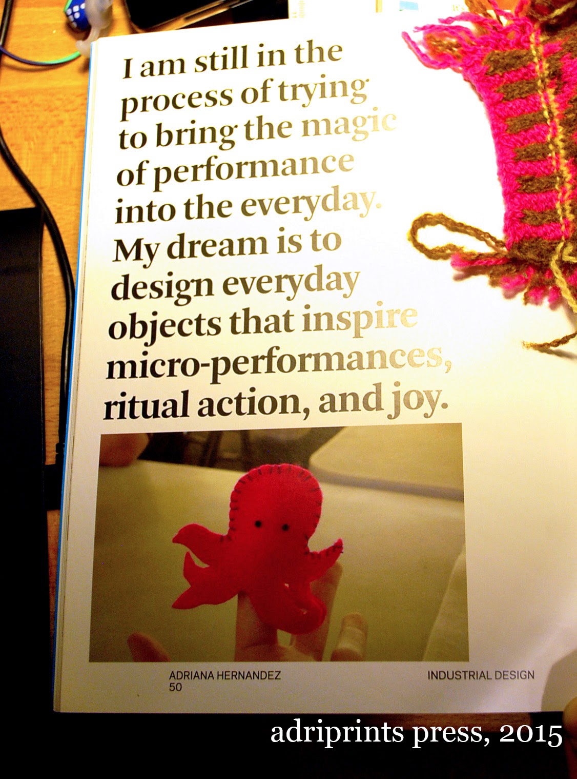
It's my entry into our class book.  I still haven't given up on that dream, I just got a little sidetracked is all.

So was it worth it?  Hell, yeah!


If you have any questions about the course or are considering it, but aren't sure, just send me an e-mail and I'll answer the best I can.  You can also write to the school itself, they're super helpful and friendly.

Sunday, April 5, 2015

MATS A, Week 5: Gifts

As I posted my final assignment for my first MATS class in the flickr group, I was really sad.  I mean it!  I was so sad it is over.  There are still a few days of "wrapping it up" and the final review, but the 5 weeks of meaty assignments with endless potential...

Wait a sec, this is just the beginning!


Put those tissues away!  Although MATS A is over, it's time for me to shift gears and get ready for phase 2!  Transition time!  This is the toughest part I think, but I've got a pretty darned good toolkit and support network to help.

My next steps in this whole illustrator as full-time career move include:

  • refining my projects based on the feedback I received
  • assembling a portfolio with enough pieces in a marketable style
  • presenting my work to companies (and/or a representative)

I've been doing research since the start of the year on artist's representatives.  Between MATS and the Skillshare, Creative Live videos, Illustration podcasts, and the books that each of my teachers have recommended, I've got a fairly good idea of what it will take for this to work... and it's a lot of WORK! :D  But, I already knew that, and hard work is quite familiar to me, and I kinda like it.

Anyway, a review of Week 5...

Mini Assignment: identify and photograph or illustrate your favorite collections of items in your life. In my case, I have a lot of scissors... and looking at the photo I realize I missed two pairs in the kitchen. Oops!  I also have a huge collection of rubber stamps and many, many items relating to what I'll call "the paper arts" - illustration, drawing, painting, drafting, etc.

yes! an authentic Caboodles case, and Corn Flakes stamps from the 1960's

I have a cute collection of house-plants, too!  It's too bad I didn't have a balcony garden this year otherwise, I'd have used those too.  Hmm, I could get my photos of them from years past for another one of these...
 And then there's the fiber arts. This is just the tip of the iceberg, but my photographed collection includes my two favorite skeins of yarn in my stash, so many spools of thread, fabric scraps, patterns, and my all-time favorite buttons... 

When our big assignment came, I wasn't sure where to go with all of these photographs and illustrations.  I was overwhelmed with the sheer number of things I had scanned, isolated, color tweaked and sketched.  Overwhelm!

I showed this image to my fellow MAT-sians at the height of my overwhelm.  I've realized this is a typical stage in the artistic process. This is the part where you feel self-doubt and uncertainty and the judge part of the brain is telling you you're nuts for attempting this.  Don't let that judge win!  My classmates helped for sure.


So, I kept plugging away at it!  I thought of a way to bring my favorite collections together and here is my secret: key phrase.  I created a key phrase to help guide me.  My phrase for this piece was "tropical vacation yarn fetish".


I started by creating creatures that lived in this overlush place, these creatures had to be over the top.  I have been dying to do mash-up creatures and I thought this would be the perfect opportunity for a little Frankensteining!  Above you can see my first creature above.  It's a jackelope iguana, but it gets butterfly wings eventually.

Here's a .GIF of how the piece developed once I got going.

Just in case it doesn't loop on its own, click on the image to see the short GIF

The materials in the class for this week were really helpful.  There was a great list of businesses that are in the gifts market, templates, and wonderful life tips.  All in all, it was a really strong week with which to finish the course.  I'm so looking forward to MATS B in the fall!


Saturday, March 28, 2015

MATS A, Week 4 Wall Art

This week was a very freeing experience for me.  Before this year's Bootcamp and MATS class, I hadn't done a proper painting in forever.  I was a scenic artist for half of my 20's and had painted giant scenic backdrops, kitschy scenic flats, furniture, design illustrations, etc.  And, this week felt like I was taking all that experience, plus a distinct perspective as an adult and I was able to just let it flow.

Here is the final mocked up in a frame...


The assignment called on several specific requirements - choose a pair of colors based on our zodiac sign, use collage, include text.  My sign corresponded to the colors pink & yellow. I was really excited about pink & yellow, but truthfully, I would have been excited no matter what the color combo.  I love getting direction and parameters to work within, and I also love color.  Yay color!


Next we had to collect 2-D and smallish 3-D items that were in our colors, a color scavenger hunt!  My studio is lightyears beyond the mess that it was last year.  I've tossed so much, and even then, I managed to have no shortage of things in these colors.

button collection and swatch for gloves WIP
ancient i-pod and lovely silks
And, once I figured out how I was gonna work, I was off to the races.  I didn't have a large enough canvas so I worked on five little canvases that I would seam together digitally.  Dekopatch, gesso, matte medium, acrylics, markers, pens, post-it notes, paper, rice paper, fabric, buttons, tissue paper, cardboard, and stamps... to name some of the things I used to make this piece.  While things were drying, I rotated the canvases and made linocut plates.  I had a really good flow going, and I was listening to my fave tunes on the ancient i-pod.

lino cut and watercolor dots
The next part, the digital seaming, was a bit more tedious, but it allowed for a kind of freedom that I hadn't had before with paint.  The ability to "undo" is an amazing weight lifted off one's shoulders.  The fear of making the next mark is completely gone, and it was great!


This project was tons of fun, y'all.  Tons.

Saturday, March 21, 2015

MATS A, Week 3 Picture Books

This week was a real eye-opener.  I've illustrated for books before, but never children's books, and that was the big theme this week.  It was exhilarating.  I had so much fun illustrating the goats and then the trolls, but I was left a bit sad afterward.  I want to keep going... I had so many ideas that I didn't get to illustrate for this one!!

Let's get to the meat here... Here's my image.  I think it's fairly easy to figure out which fairytale this particular scene represents, but just in case... it's from "The Three Billy Goats Gruff".  It's when the littlest goat first meets the troll.


During my research phase (all of 30 minutes), I found out that goat farmers don't like calling male goats "billies" and they prefer the intact male goats be called "bucks" or "rams."  There you have it!  And, this story is really, really violent!  I cannot imagine illustrating the traditional story for super young kids.  I left that to my peers and they did some lovely innocent twists on the story.  I took the assignment as-is, and my direction aimed toward a bit older audience (kids maybe 8+ years old).

I thought it would be really cool to do a comic/graphic novel-type hybrid with the picture book and proposed inserting two panels to illustrate the fear and panic of the littlest goat, but my peers thought it took away from my illustration. The leftmost inserts would have been black and white and shown the hooves of the little guy as he first steps onto the bridge. Dramatic!!  I'd love to hear what you think!


I found that my scenic art background came in really handy in this assignment.  It's what I enjoyed the most.  I loved painting the background and creating the forest and the waves.  AAND, I especially loved doing the troll.  So much fun!  His back absesses and hair and six fingers, yellow teeth, etc. etc.  Had I more time to develop my characters I wanted to add a bat and mushrooms, dead animals, etc. to his fur.  So many ideas!

And, for my fellow artist and illustrator friends who are curious about my process...

Here's are a few WIP screenshots...


And the character development phase...

These are the two fave pages of goats.  There were maybe 10 or 12 sheets full of goats. :D

"Friends" or maybe "Three's Company" meets "3 Billy Goats Gruff":

Baby Goats!!

This week's course materials were really great. The interview with Mike Lowery reminded me that illustrators are people.  Yes, I know, I'm an illustrator and also qualify as a person.  But, sometimes we make such a pedestal out of our dreams that we forget the daily steps it took for regular people to get there!  There was also an interview with a Hatchett Book art director which was really great for learning the process by which picture books become a reality.  It sounds lengthy, but I know a thing or two about that (see my knitting designs)!

Aaaand, this week's favorite for me was actually a bonus by Lilla.  She included this really great worksheet about dealing with self-critique and envy.  I'm constantly at odds with myself.  "Is my style good enough? Marketable enough?  Is it even a style?" All these doubts!  It's great to hear I'm not alone.  Although, it would also be great to have actual answers to these questions. HAH!  Whatever the case may be, I look forward to "Wall Art" which is next week's assignment.

Monday, March 16, 2015

MATS A, Week 2: Home Decor

Review of Week 2, MATS Part A which focused on Home Decor.


We started the week with Monday's Mini Assignment which was "go crazy with paisley!"  And I did!
I went ahead and went crazy doing different graphite illustrations on wacky paisley motifs thinking we were going to do bedding or bathroom textiles, maybe even upholstery or a room.  I imagined paisley swamps and bogs and that's where my head was when I started illustrating for this project... some kind of paisley pond world.

And then we got the main assignment: plates.  One of the worksheets that came with this week's assignment had this very important question when thinking about plates: Would you eat off of it?  My stomach had a sinking feeling when I came to that question.  It had never crossed my mind that we'd end up focusing on plates!  Some of my illustrations were not really food friendly... frogs eating flies, hungry anyone?!


It is a tough question, isn't it?  If it's a decorative plate, then no, I wouldn't eat off of it.  But, my utilitarian tendencies wouldn't let it go at that simple solution.  I couldn't just design decorative plates.  I don't own any purely decorative plates, and it was an important aspect of this week's project to be your own customer.  I worked through the designs until I felt that these were a series of plates I could see myself picking up and serving desserts or summer drinks or a festive picnic meal.  I learned this about myself - I am picky.

Here's the progression of one of the plates, the upper right one in the layout.

And then of course, there's the real-life stuff that kind of stressed me out.  We were traveling and we had no internet access, and I bought a hot-spot card to use the city's wi-fi, but it was spotty at best. Little dude was finding everything exciting and did not want to sleep or nap, which made it a bit of a a time crunch. We were at this ridiculous cloister atop a giant hill in a tiny town in Germany, and it was beautiful... but technologically desolate.

Thoughts on Week 2 Course Materials

With this week came a wonderful set of worksheets that had some great questions about this market and specifically plates.  These are the kind of questions that get you un-stuck when you've made progress, but aren't "finished".  I am treasuring them.  They're the "Hey did you think about this or that?" aspect of illustration.  I tend to sketch quickly and get things into the computer and then find myself all self-doubty at some point.  Those questions are invaluable!

The interview this week was with a Crate + Barrel art director and it was interesting to read how she makes decisions on artwork.

So, is the Home Decor market for me?  I think it could be, but I still like the puzzle aspect of bolt fabric better.  Home Decor felt like the ocean to me, and I like knowing where the edges of the pool are when I'm illustrating.  Maybe I'll feel differently depending on the item.

Also, a special shout-out to my fellow MATS-ians.  Thanks for your help pushing me forward this week!  I needed it.

Saturday, March 7, 2015

MATS A, Week 1: Bolt Fabric

The first week of MATS (Make Art That Sells) Part A went really, really well.  I was so anxious and scared to begin with, but I felt right at home illustrating the mini, and then later the actual assignment.  My fellow classmates were super supportive, and their work is really great!  It's awesome to see what others are doing and it helps me to figure out what to tweak next.  I see how they handle certain elements within a design and it sparks a solution in me.  Lots of zeitgeist, enthusiasm, feedback, and visual inspiration!

I also like that the turnaround times are short in order to force me not to spin my wheels.  I have the tendency to overthink things if given too much time.  The deadlines of the course plus the unpredictability of the baby's toddler's schedule make for a nice sense of urgency that makes me productive!  This past Thursday night I turned in my final, and here's what it looks like...


This was the layout that I turned in, and I'd like to change certain elements moving forward, but I'm happy with the overall direction I chose.  Our mini theme was "pretty peppers and pyrex" and then the big assignment was "vintage kitchen" as the target niche.  I kind of tweaked the theme to "I love Tex Mex please join me in celebrating my love for enchiladas through the lens of 1972."

As many of you who know me already know, I lived in Texas for a few years and my husband is Texan.  His family live in the southwest and we visit nearly every year.  Here in Germany, Tex-Mex can be found, but it's not the same.  When I visit TX and NM, the food is something I enjoy very, very much (I nearly went with vintage + BBQ!).

Interestingly enough, living in Germany for so long seems to have rubbed off on me.  One of the coordinates ended up looking like one of my favorite traditional dirndl fabrics (the green/white one on the lower right).  I think it would be really cool to have a dirndl with chiles on the bodice or apron!!

Process
Mini: peppers n' pyrex
Original Mood-board


Roughs
first linocut in over 10 years!


To give you a breakdown of what I was working with, I scanned in my images and isolated roughly 80 to 90 individual icons. Once the additional category of "vintage kitchen" was given, I shopped among them for the most appropriate ones.  I had already digitized them, but not yet colored them.  Next, I added textures, finessed the little details... but there's always more to do.  If anything, I've already learned that.  The details make or break the illustration.

Thoughts on Week 1 Course Materials
I found the break-down of the assignment to be very helpful.  I love the act of chunking the work into tasty morsels, and so the structure of the class suits me well.  Most days we had a post to read, an interview to watch, skills to learn and/or industry tips and tricks to absorb.

The information given in the class materials is really specific and valuable.  This past week there were even additional workshop materials from the Art & Business of Surface Pattern Design course that I considered taking.  I think I'm in the right place because I already have a pretty good understanding of the technical aspects of making a repeat through my background experience with Illustrator and the Creative Live, Skillshare classes from Bonnie Christine and Elizabeth Olwen, and the books I read on pattern design.

But, the interview with an industry professional was invaluable.  So was the style analysis worksheet and Lilla's advice.  In short, I'm so glad to be taking this course.  It's exactly what I needed!